Boost Your Web Design Game with TailwindCSS Utility Classes: A Beginner's Guide

In the fast-paced world of web design, efficiency is the name of the game. As web developers, we seek tools and techniques to streamline our workflow and create stunning and responsive websites. That's where TailwindCSS comes into play.
TailwindCSS is a utility-first CSS framework that allows you to build and customize web interfaces. With its extensive collection of utility classes, achieving a wide range of designs without writing CSS is easy. Whether you're an expert or non-expert developer, TailwindCSS can help you boost your web design game.
In this beginner's guide, you'll go through the essential aspects of TailwindCSS, step by step. By the end of this tutorial, you'll have the knowledge and skills to create responsive and appealing web designs.
Prerequisites
To follow along with this tutorial, you need a basic knowledge of HTML and CSS. You should also have the following tools installed, a text editor, NodeJs, and NPM(Node Package Manager)
Getting Started with Tailwind CSS
In the realm of web development, crafting beautiful and responsive user interfaces is a formidable task. Yet, with the advent of TailwindCSS, the art of web design is about to undergo a transformation.
In this section, you will explore the essentials of TailwindCSS, with the power of Visual Studio Code.
Creating Your First TailwindCSS Project
With VSCode at your fingertips, it’s time to create your first TailwindCSS project. Open VSCode and initiate a new project directory.
Installing TailwindCSS
NPM is a recommended approach to installing TailwindCSS. To open the terminal in the VSCode, use the “Ctrl + ” keyboard shortcut to show or hide the Terminal window.
Installation TailwindCSS
Using npm
To install TailwindCSS, the first step is to run the following command in the terminal in your project directory:
```
npm install tailwindcss
```
This command will create package.json, package-lock.json, and node-modules in the file directory.
Next, run the following command
```
npx tailwindcss init --full
```
The command above will create the tailwind.config.js file in the root directory, which is a complete configuration file that includes all the default configurations.
Inside the tailwind.config.js, replace the value of the content field with the paths to all the files you will be using in your project.
The content field is where you configure the paths of your HTML templates, JavaScript components, and any other source files that contain Tailwind class names. For a better understanding, read more on how to configure the source path.
Next, you need to add TailwindCSS to your CSS by adding the following code inside the “styles.css” file like this:
@tailwind base;
@tailwind components
@tailwind utilities
Next, create a new CSS file, I’ll name mine default.css inside the CSS folder. Then run the following command in the terminal
```
npx tailwindcss -i ./css/styles.css -o ./css/default.css --watch
```
The command above initializes the project’s main CSS file(`styles.css`) and redirects it to the new CSS file we created (`default.css`). Now you have all the styles you need for your project.
Next, add your compiled CSS file to the head tag: This is the last step. This links the new CSS file(`default.css`) to the index.html file in the head tag using the link tag like this:
```
<link rel="stylesheet" href="./CSS/default.css">
```
Using CDN (Content Delivery Network)
You can include TailwindCSS through a CDN in your HTML file if you prefer not to use NPM. CDN is like a network of helper servers that store and deliver your website's content. It makes your website load faster, distributes the traffic efficiently, and provides an extra layer of security. It's an essential tool for web developers to optimize the performance and reliability of their websites, especially for a global audience. Here's how to do it:
- Add the following link in the <head> section of your HTML file:
```
<link href =”https://cdn.jsdeliver.net/npm/tailwindcss@2.2.19/dist/tailwind.min.css”
rel="stylesheet">
```
This link includes the minified version of TailwindCSS from the CDN
Basic Uses of TailwindCSS Classes
TailwindCSS is all about using utility classes in your HTML. These classes provide you with excess styling options for your web elements. For instance, to create a button with TailwindCSS, you can use classes like “bg-blue-500” for the background color and “text-white” for the text color.
The result:
In the example above, you've utilized classes to style the background color, text color, padding, and rounded corners of the button.
Example of Creating a Simple Web Page
Now, let's put what you've learned into practice by creating a simple web page. Here's a basic HTML structure for a page that includes a header, a section, and a footer, all styled using TailwindCSS:
In the body tag, write this:
```
<header class=”bg-blue-500 text-white p-2”>
<h1 class =”text-4xl font-extrabold”>Welcome to my web page</h1>
</header>
<section class =”p-6”
<p class = “text-lg”>This is a simple web page created with TailwindCSS. </p>
</section>
<footer class=”bg-gray-200 p-4 text-center”> © 2023 My Web Page
</footer>
```
Output:
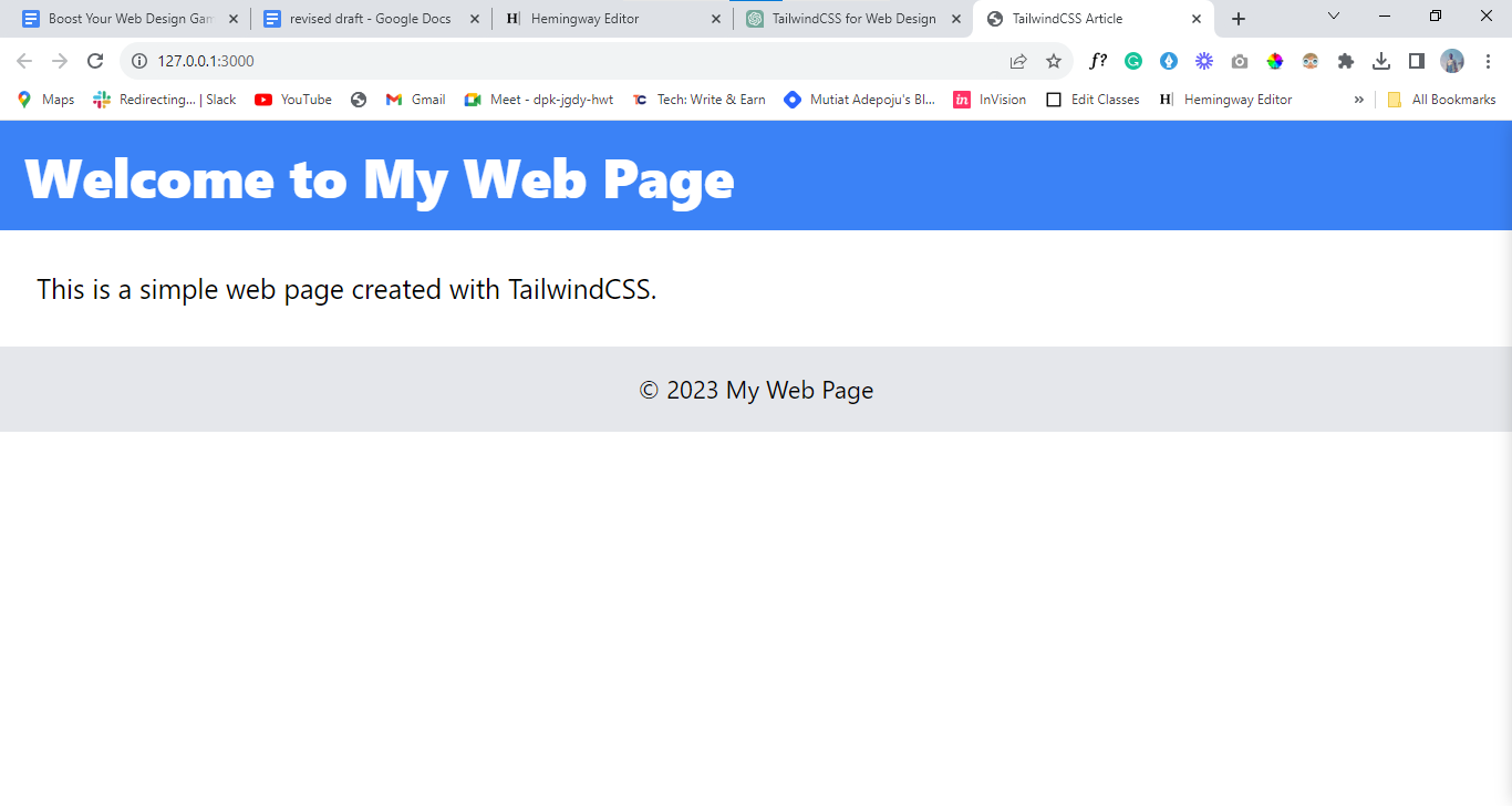
In this example, you've used TailwindCSS classes to style the header, section, and footer.
Now that you have your TailwindCSS installed in your project, and you've grasped the basics of getting started with TailwindCSS, let’s delve into mastering Tailwind utility classes.
TailwindCSS Utility Classes
The term "utility classes" refers to the individual CSS classes provided by Tailwind CSS, they are designed to apply a specific and practical purpose in styling and layout. It covers a variety of properties, such as margins, padding, typography, color, the flex and grid classes are your go-to tools for creating versatile layouts.
Layout and Spacing
The flex classes enable flexible content containers, while grid classes allow you to design grid-based layouts and more. TailwindCSS provides a robust set of classes to help you create responsive and well-structured layouts. Using Flex Classes
The flex classes are useful for responsive design. You can control the alignment, ordering, and sizing of elements within a flex container. Here's a basic example:
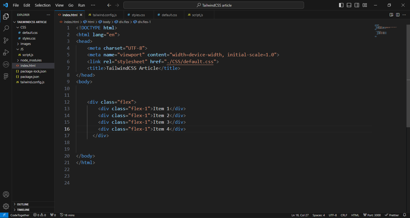
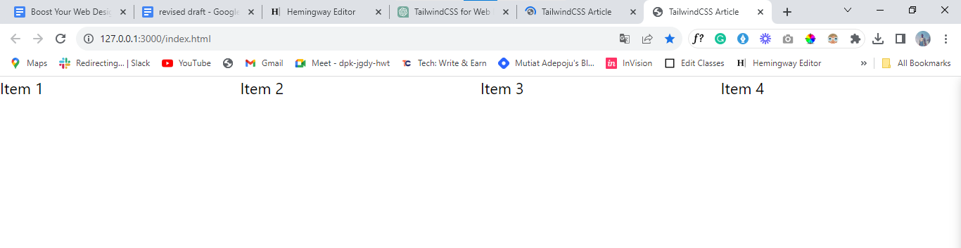
In the example above, you have four elements within a flex container. The flex-1, flex-2, flex-3, and flex-4 classes dictate the ratio of available space they occupy. The flex is always in the horizontal direction. You can adjust these classes to fine-tune your layout.
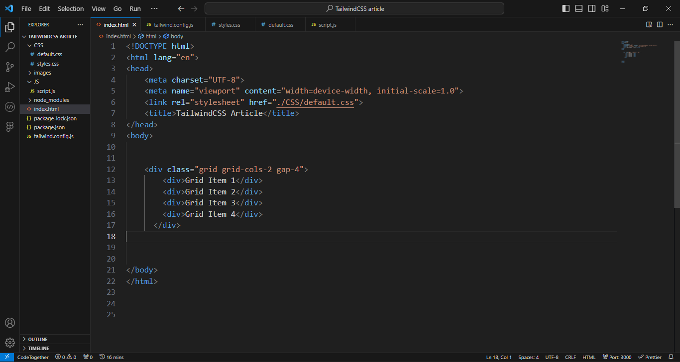
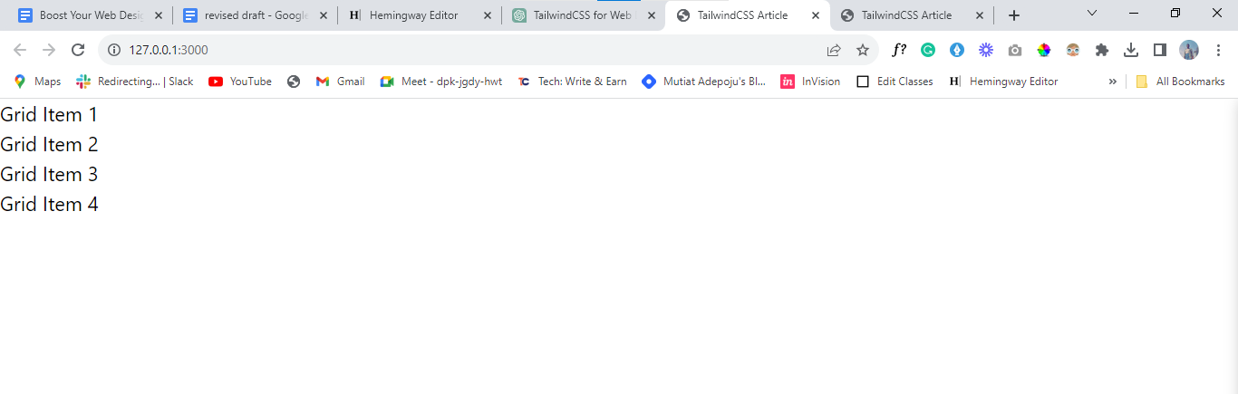
Using Grid Classes
Grid layouts are perfect for arranging elements in a structured manner. TailwindCSS offers a grid system that makes it easy to create responsive grids. The grid layout is always in the vertical direction. Here's an example:
Margin and Padding Classes
The effective use of margin and padding classes in TailwindCSS is essential for maintaining proper spacing and alignment in your layout.
Here's a quick overview of margin classes in TailwindCSS:
1. Margin on All Sides:
- “m-4” adds a margin of 1rem to all sides (top, right, bottom, left)
2. The margin on Specific Sides :
“mt-6” adds a margin-top of 1.5rem
“mr-8” adds a margin-right of 2rem
“mb-10” adds a margin-bottom of 2.5rem.
“ml-12” adds a margin-left of 3rem
3. Negative Margin :
“m-n4” adds a negative margin of 1rem to all sides. We usethis to overlap elements
Here's a quick overview of padding classes in TailwindCSS:
1. Padding on All Sides:
“p-4” adds a padding of 1rem to all sides (top, right, bottom, left).
2. Padding on Specific Sides
“pt-6” adds padding-top of 1.5rem.
“pr-8” adds padding right of 2rem.
“pb-10” adds padding-bottom of 2.5rem.
“pl-12” adds padding-left of 3rem.
3. Padding Inside an Element
You can apply padding inside an element to create space for the content
`<div class="p-6">
<p>This content has padding.</p>
</div>`
Remember, you can adjust the numeric values in these classes to control the amount of margin and padding according to your design needs. TailwindCSS's flexibility makes it easy to achieve consistent spacing and alignment in your web design.
In the next section, you'll explore text styling and typography, enhancing the aesthetics of your web design.
Typography and Text Styling
In this section, you'll explore how TailwindCSS empowers you to style text in your web design. Text-related classes in TailwindCSS allow you to control fonts, text sizes, colors, text styles, and more.
Fonts, Sizes, and Colors
One of the essential aspects of typography is the choice of font, text size, and color. TailwindCSS simplifies text styling with its utility classes. Now, let’s pick them one by one
Font Family Classes
1. Sans-serif Font : Use “font-sans” to apply a sans-serif font to an element.
Output:
2. Serif Font: Apply the “serif font” using the “font-serif” class.
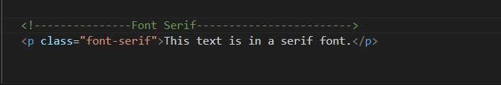
Output:
- Monospace Font
The “font-mono” class sets the font to monospace
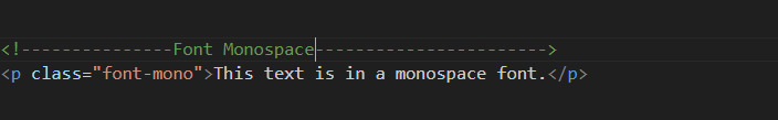
Output:

Text Size Classes
The text size classes include:
- Text Size - Extra Small
Use “text-xs” to set the text size to an extra small
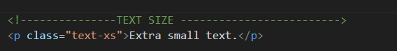
Output:

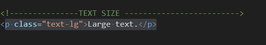
- Text Size - Large
The text-lg class increases the text size to large text.
Output:

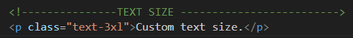
Custom Text Size
You can define a custom text size using the “text-[size]” class. Replace “[size]” with the desired size, such as “text-3x”l for extra-large text
Output:
Text Color Classes
Some of the text color classes are:
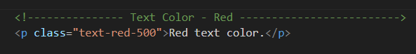
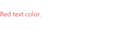
- Text Color - Red: Use classes like text-red-500 to set the text color to red. You can choose from a wide range of predefined colors.
Output:
2. Custom Text Color: Define the custom text colors using the “text-[color]” class. Replace “[color]” with the color value in your project's configuration.
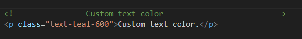
The Output:

Text Styles and Headings
TailwindCSS makes it effortless to apply different text styles to your content. You can use classes like “font-bold” for bold text,” italic” for italicized text, and “uppercase” to transform text to uppercase. Here's an example:
Text Styles:
The text style includes:
- Bold Text: To make the text bold, use the font-bold class.
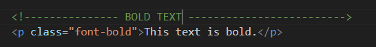
The Output:

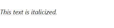
- Italic Text: Apply italics to text using the “italic” class.
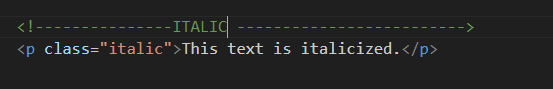
The Output:
- Uppercase Text: Use the “uppercase” class to transform text to uppercase.
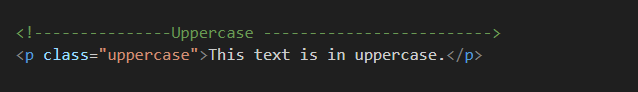
The Output:

Headings
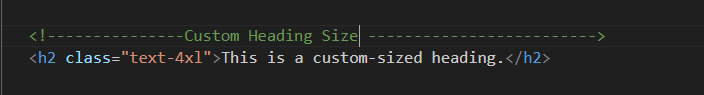
- Custom Heading Size: TailwindCSS provides classes like “text-2xl” to set a custom size for headings. You can use classes from “text-2xl” to “text-6xl” to control the size.
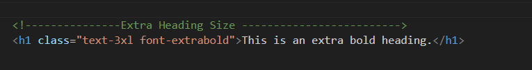
- Extra Bold Heading: To create an extra bold heading, you can combine the “font-extrabold” class with the desired text size class.
Text Alignment, Line Height, and Text Decoration
Controlling the alignment, line height, and text decoration are critical aspects of text styling. With TailwindCSS, you can easily achieve these effects.
Text Alignment
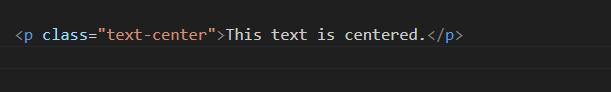
1. Center Alignment: To center-align text within an element, use the “text-center “ class.
The Output:

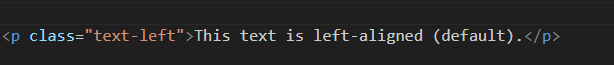
2. Left Alignment: By default, the text is on the left side of the page, but you can use the “text-left” class for clarity.
The Output:
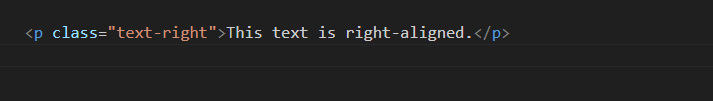
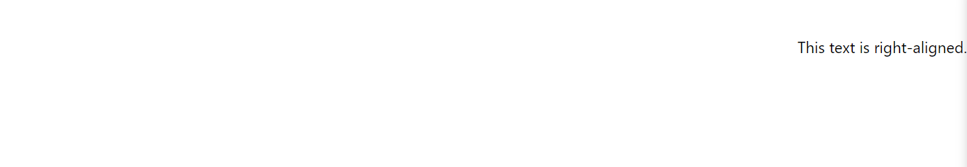
3. Right Alignment: For right alignment, apply the “text-right” class. For example,
The Output:
Text Decoration
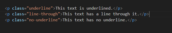
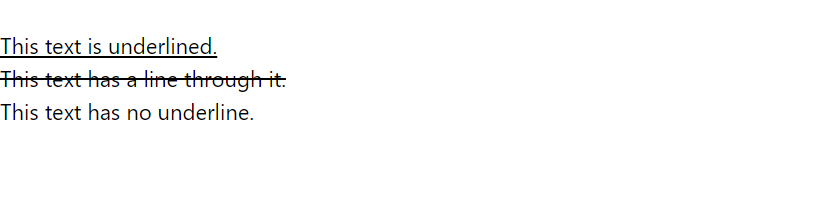
1. Underlined Text: To underline text, use the “underline” class
2. Line-Through Text: To add a line through text, apply the “line-through” class.
- No Underline: To remove underlines from links or other text elements, use the “no-underline” class.
The Output:
In the next section, we'll delve into backgrounds and colors, further enhancing the visual appeal of your web design.
Backgrounds and Colors
TailwindCSS provides a comprehensive set of utility classes for manipulating background colors and gradients. Now you'll delve into how you can use these classes to enhance the visual appeal of your web design.
Background Color and Gradient Classes
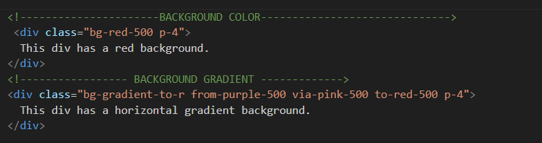
Background Color: One of the most straightforward ways to style backgrounds is by using background color classes. You can set the background color of an element by applying classes like “bg-red-500”, which will give you a red background.
Background Gradient: TailwindCSS also makes it easy to create gradients. You can add gradient backgrounds using classes like “bg-gradient-to-r”, followed by the gradient color names.
The Output:
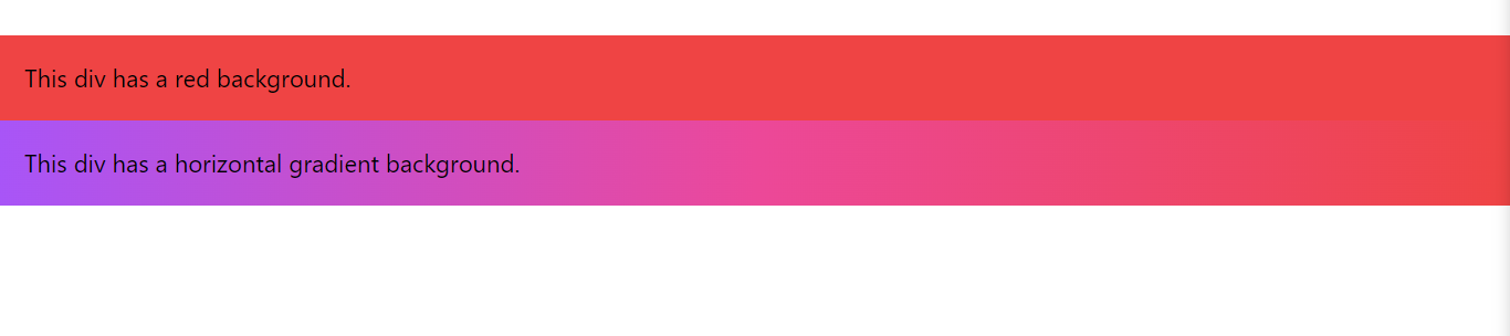
In the second example above, we've applied a horizontal gradient background that transitions from purple to pink to red.
Conclusion
In this tutorial, you learned how to start using TailwindCSS, including installation and basic usage. You've explored the power of utility classes to style your web elements, create layouts, control spacing, and enhance text styling. The article has taken you through various aspects of TailwindCSS, from installation to layout and spacing, typography, text styles, and backgrounds.
To continue your TailwindCSS education and discover more about this fantastic framework, I encourage you to explore TailwindCSS. There, you'll find in-depth documentation, tutorials, and resources to fuel your creativity and create stunning web designs with ease.


